Verlas
Introducing UX practices to a redesigned Press Media page
UX Research, Wireframing, UX/UI Design
My role
Product Designer
Responsibilities
Research
Wireframing
Responsive Design
Engineering Handoff
Timeline
1 month
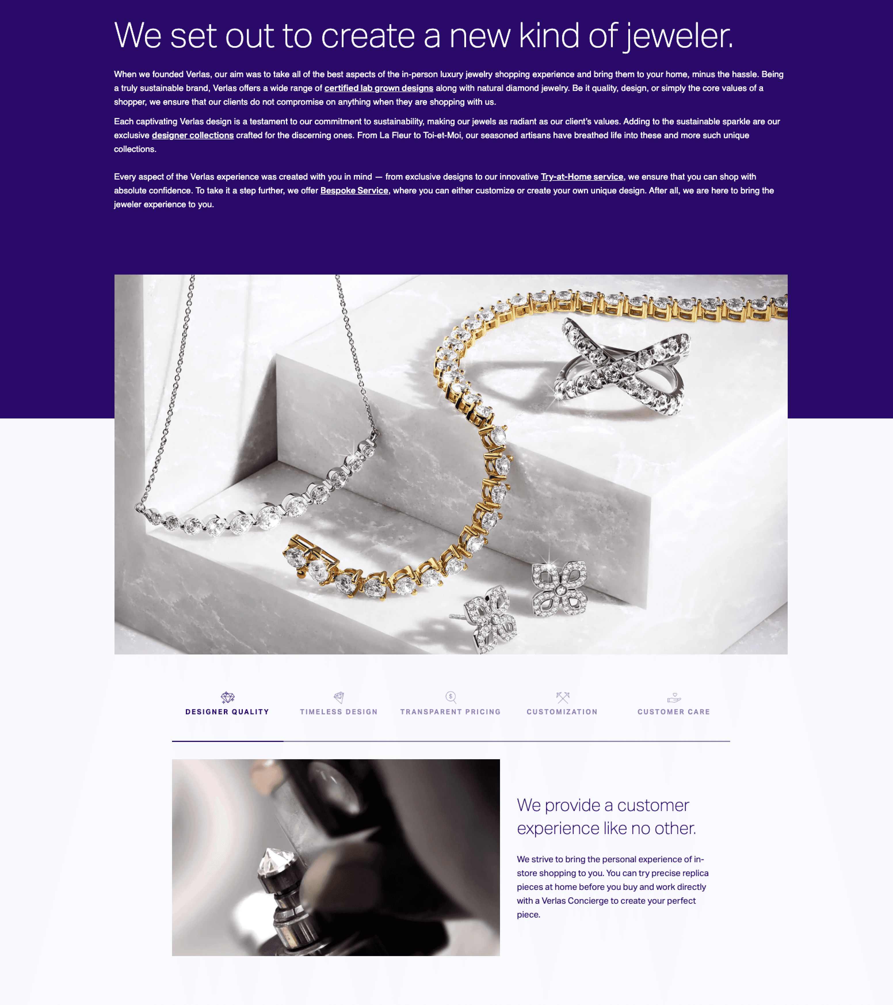
Verlas is a jewelry brand with a focus on bringing convenience and sustainability to the luxury jewelry space. When I joined the team, the company was rapidly growing and looking for opportunities to spread the word about this new, up-and-coming brand.
This was my first project with Verlas who had previously kickstarted their digital presence with help from agencies. There was little in-house, institutional experience in digital design, so in conjunction with this project I helped introduce a more rigorous, human-centered design process to the team.
Context
How can we leverage press coverage to build trust and engagement with the community?
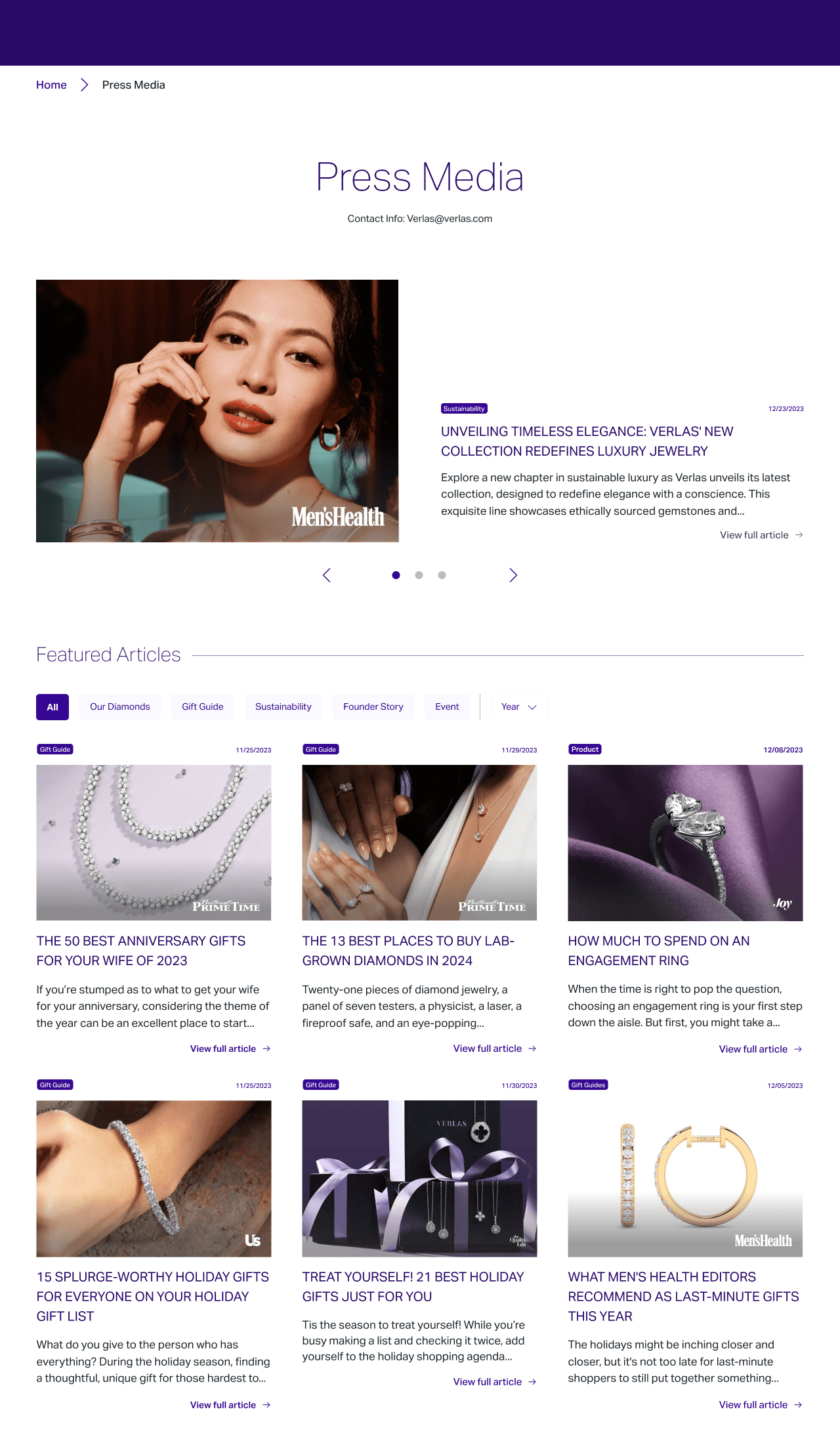
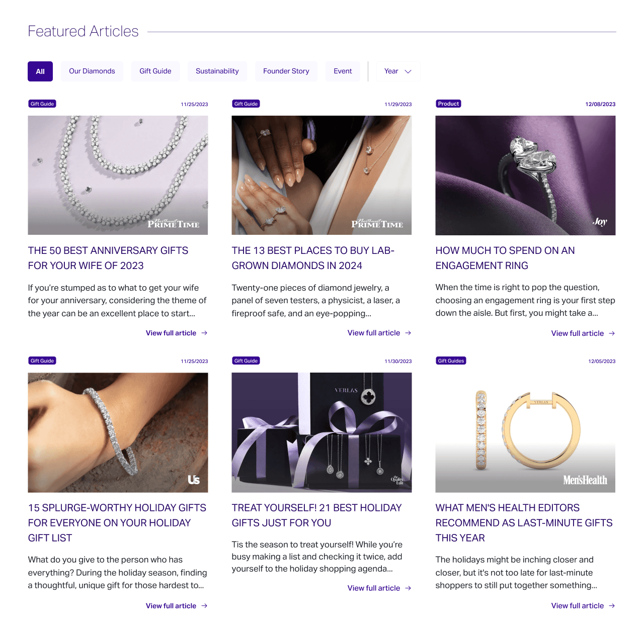
Verlas has garnered more than 100 press articles, a testament to the company's ability to establish itself as a newcomer in the jewelry industry and build credibility and trust with its audience and potential customers.
However, the press page grew organically without a clear design direction, resulting in discoverability issues, browsing difficulties, and numerous visual inconsistencies. I took a step back and reimagined the page from the ground up.
Research
Establishing core usability guidelines for the page
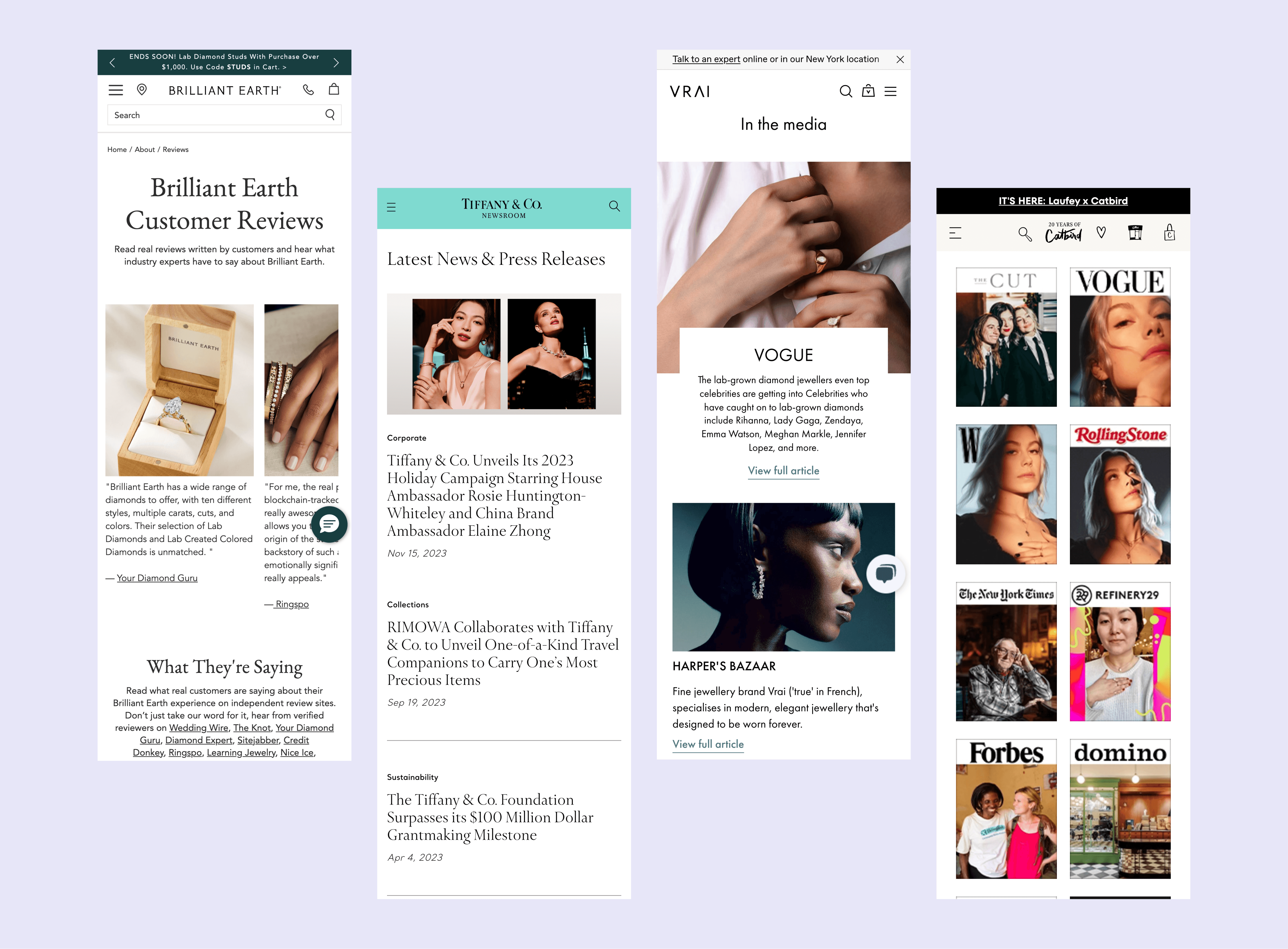
Competitor press pages
I analyzed 5 peers in the high-end/luxury retail space - Tiffany, Brilliant Earth, Vrai, Catbird, and Away to get a sense of what patterns we could adopt and what we should avoid. A full exploration can be seen here. Taking learnings from this analysis, I identified several key principles to adhere to for this design.
✔️ Context - Articles should have a relevant image, title, brief description, and date. Together these helps users quickly build understanding of the article contents and improve scannability.
✔️ Trusted - Article source should be prominently displayed allowing users to build a sense of trust with Verlas' reputation
✔️ Explorable - Users should be able to quickly find articles relevant to their interests filtering by date and subject
Design
Keeping our focus on usability first through UX best practices.
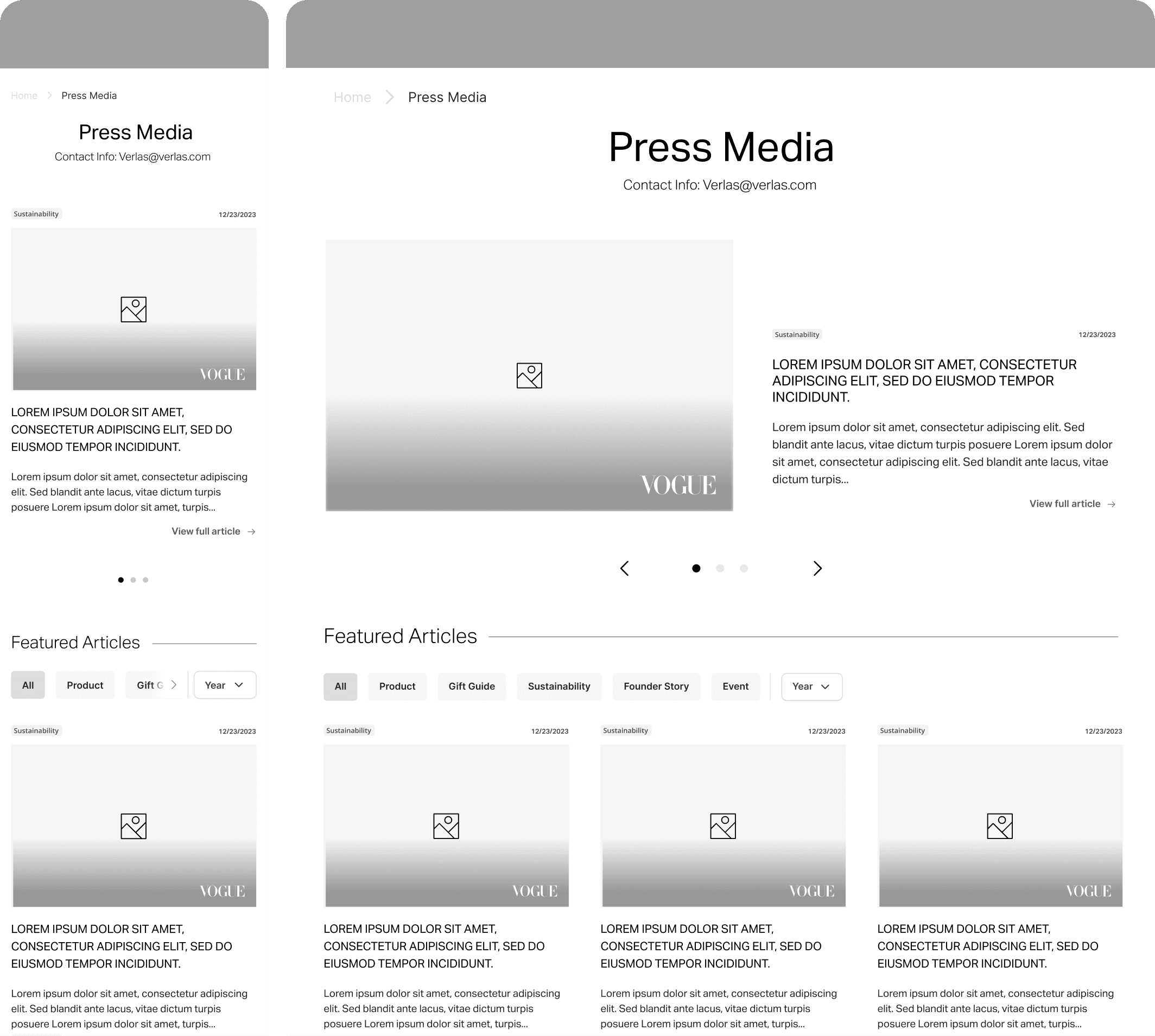
Wireframe
I created a wireframe to focus the team's feedback on the core usability elements of the page, avoiding the distractions that a high-fidelity mockup might introduce. I considered the core user scenarios our page needed to support and incorporated those into my design. Specifically, as a business, we wanted to highlight significant articles, while users with specific intentions were likely searching for a particular topic. To address these scenarios, I included a featured section and added filterable labels to the page.
The overall layout was well received. Given that we would ultimately include more than 100 articles, I also recommended adding a time-based filter to help users more effectively navigate our extensive library.
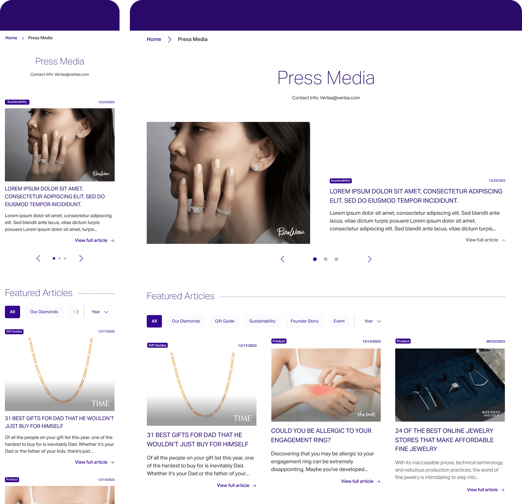
Hi-fi mocks
Using Verlas' existing brand colors as a guide, I created a high-fidelity mockup. I incorporated various types of images, titles, and logos to ensure the design was flexible enough to accommodate real entries. Because I had involved the team throughout the process, there was minimal feedback at this stage. The final step was handing it off to the engineering team for implementation.
Wrapping Up
Working with engineering to bring the vision to life and lessons learned.
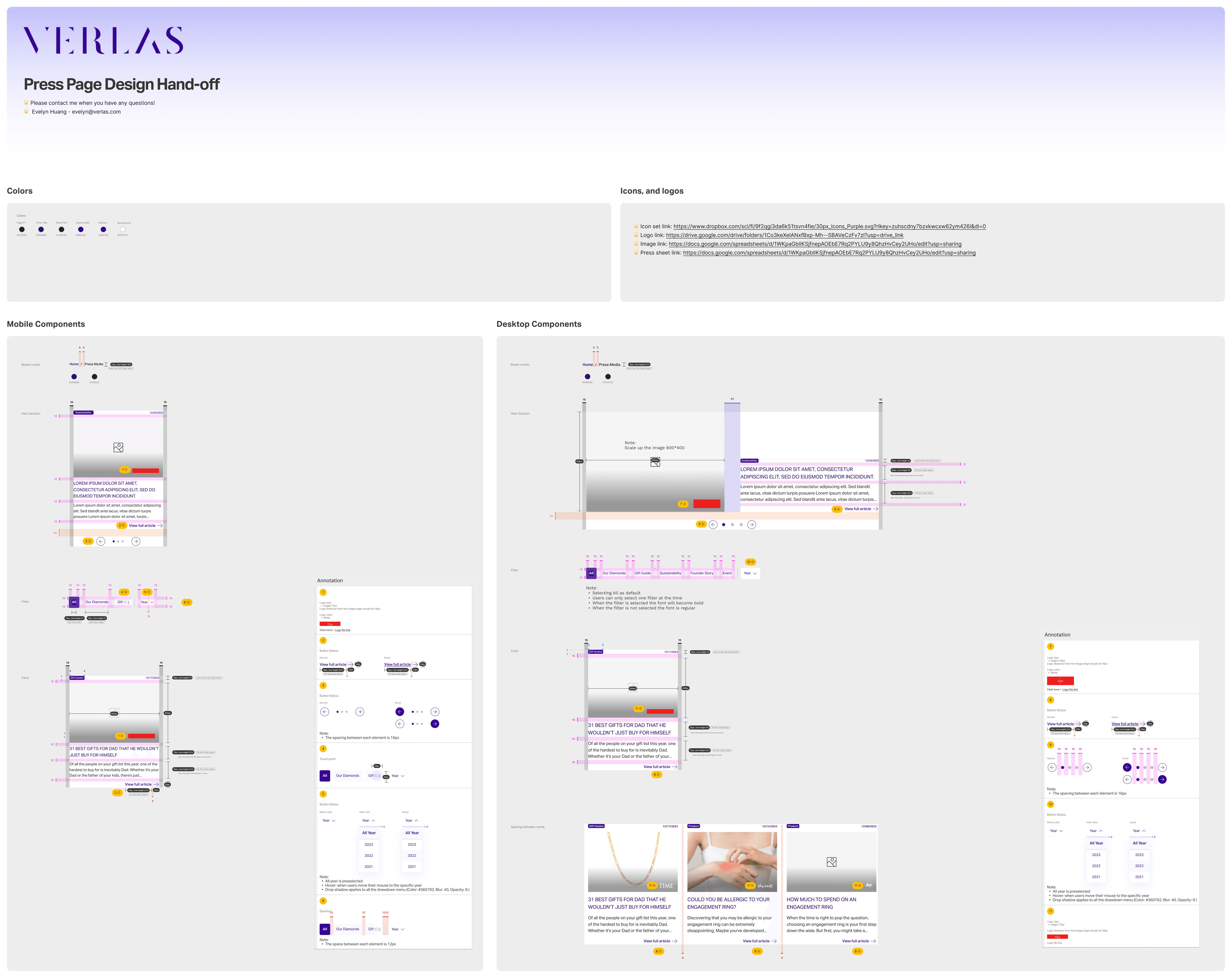
Component level spec doc
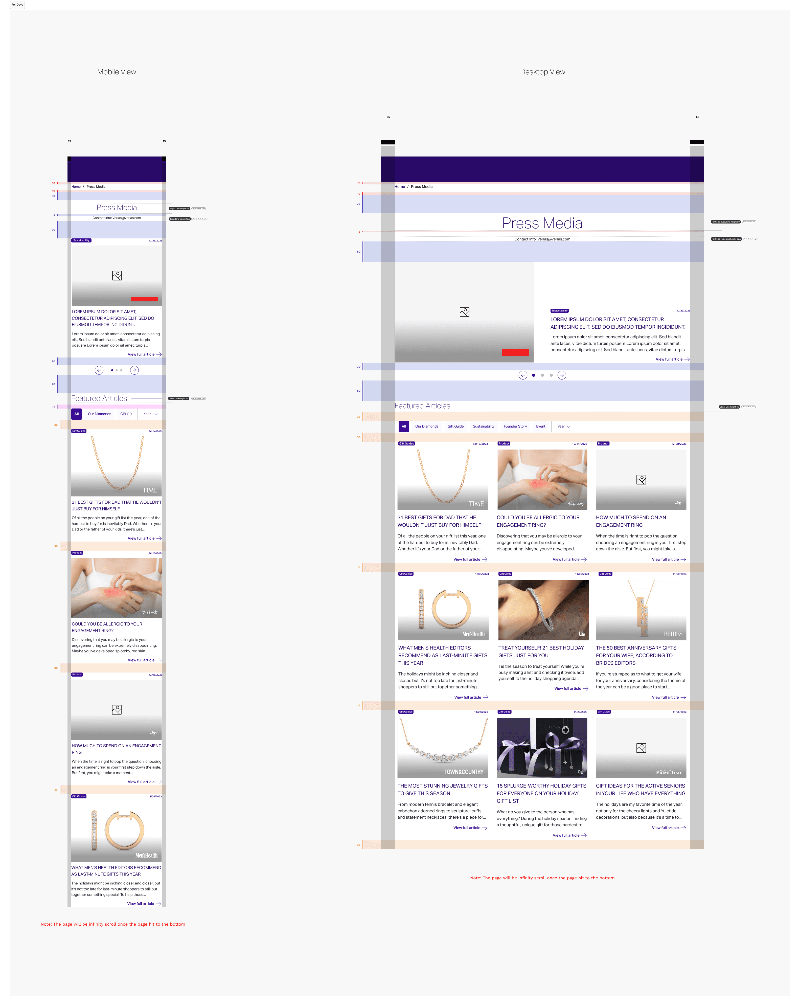
Page level spec doc
I created a detailed specification document to guide the engineering team through the exact requirements for building the page, both at the page level and for each individual component. I then scheduled a meeting to walk them through the document and address any questions they had. We discovered there were several specifications which would be difficult to implement and I continued working with the team to adjust the design as needed.
So, what did I learn?
Bring stakeholders along - Compared to previous projects, the final review was significantly smoother because I consistently engaged stakeholders at every step. Presenting my research helped set the context for the challenges we faced, and wireframing clearly demonstrated how we would address them. By involving stakeholders throughout the process—without the distractions of color and images—we were able to focus on creating a product that was not only beautiful but also highly usable.
Don't forget engineering! - I put significant effort into the design, culminating in the final spec document, but it wasn't until I met with the engineering team that we realized some parts of the design couldn’t be implemented. Involving them earlier in the process would have led to a more realistic and achievable design that we could actually deliver to our users.
Let's Create Together
evelynhuang.job@gmail.com