Playground Sessions
Connecting acoustic piano users to a digital learning experience
UX Research, Wireframing, UX/UI Design
My role
Product Designer
Responsibilities
User Flow
Wireframing
Engineering Handoff
Timeline
1 month
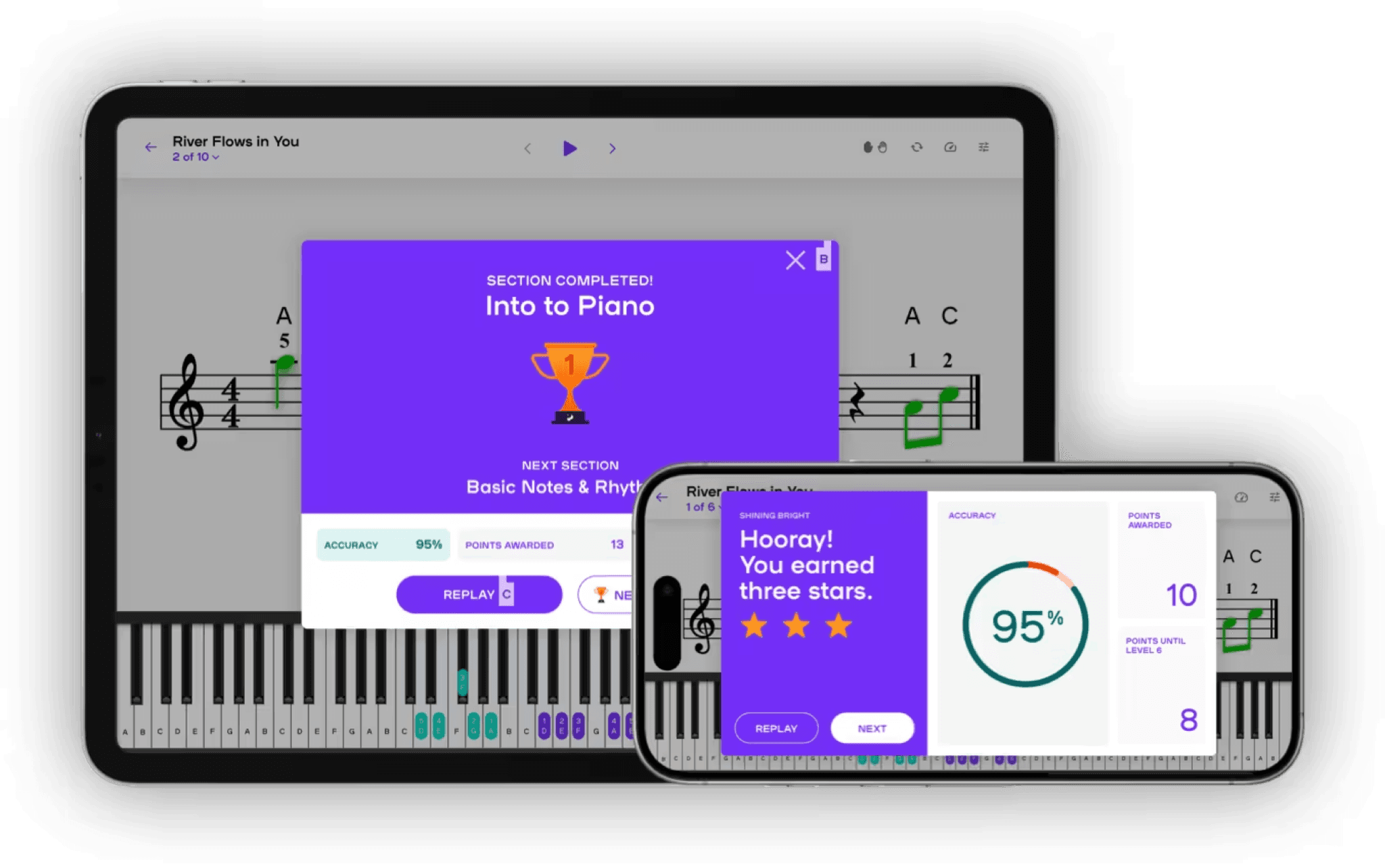
Playground Sessions, a digital piano learning app, enables users to connect their digital instruments via MIDI, allowing the app to track key presses and match them to the lessons in real time. This creates an interactive learning environment where users receive immediate feedback and scores based on their performance.
I came in to help the team address the challenge of expanding to support acoustic piano owners. With much of the app designed for connected, digital users in mind, my goal was to create a simple and unobtrusive path for this new group.
Context
How can we offer a world-class learning experience to acoustic piano owners?
Enabling support for acoustic players was not a simple challenge. Several competitors achieved this through note detection software, allowing acoustic piano players to participate in lessons without a MIDI connection. While Playground Sessions intended to develop similar functionality in the long run, the process would require a significant time investment. They needed an interim solution to onboard and support non-MIDI device users, ensuring they could fully engage with the app.
There were two challenges to solve - 1) the onboarding flow would need to support a non-MIDI option and 2) the team wanted to enable progress tracking for non-MIDI users.
Research
Balancing the addition of an entirely new category of users without creating a complex user flow
Competitive Analysis
To ground myself in the problem, I first spent went through the new user and lesson tracking experience with both the Playground Sessions app as well as 5 of its main competitors. I hoped to understand what frustrations and expectations a user without a MIDI device might encounter and how others handled those same problems.
Note detection support offered the best experience that was at parity with connecting a MIDI device. However, few apps supported this feature and across all that didn't they were very inconsistent in manual self grading and overall lesson tracking features. I summarized my findings and presented them to the lead UX designer and the CEO. Coming out of this discussion we felt that it was necessary to have a comprehensive experience supporting non-MIDI devices from initial setup to in-lesson grading and finally tracking overall progress on the dashboard.
User Flow
Before jumping into design, I took some time to map out the onboarding user to make sure we looked around corners and exhausted all the various scenarios a user my encounter during setup of the app - specifically making sure we could accommodate users who sometimes switched between MIDI and non-MIDI modes.

Design
Unifying divergent flows into a singular experience
Onboarding Flow
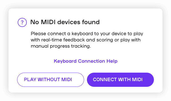
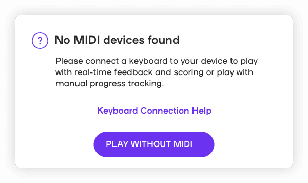
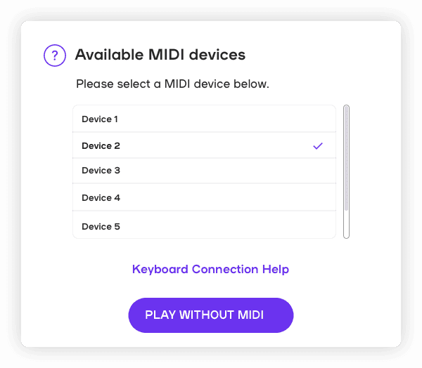
Initially I proposed an onboarding screen that upon failure to detect a connected MIDI devices, allowed users to select between a Continue without MIDI vs a Connect option. However on reviewing with the team, since MIDI detection was all automatically done within the app and there were no existing screens to walkthrough a new MIDI connection, I simplified these screens to a single button.
Version 1
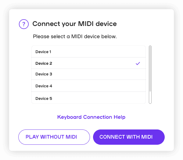
Version 2
Lesson Tracking - Iteration 1
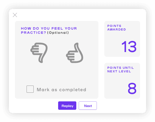
With a MIDI device, users were automatically graded and only passed the lesson if they scored above 80%. My initial approach was a simplified grading system using a thumbs up or down. Additionally, if users selected a thumbs up, the "mark as completed" checkbox would also automatically be checked. My reasoning was that this captured the core of self grading which is whether or not the user was satisfied with their performance of the lesson and this was an easy and intuitive approach.
On discussing with the team, I discovered that this would be more complex than I imagined as the rating system would need to be updated to support the thumbs up/down. Additionally, we wanted to make it very explicit that self grading and marking lessons as complete was completely optional.
Lesson Tracking - Iteration 2
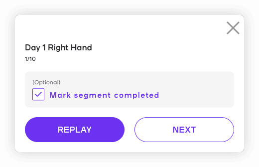
In the next iteration I pared it down to an optional Mark Complete checkbox and created several versions playing around with the location and visual hierarchy of the checkbox. We discussed adding in lesson and segment information to the header to also make clearer which lesson was being completed. Ultimately we settled on the following design.

Wrapping Up
Hand off and reflection
In-context mock
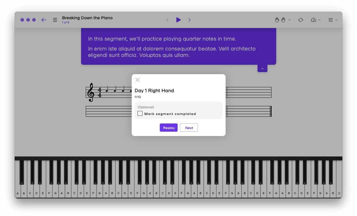
In addition to the usual specifications, I was also asked to put together screens showing the designs in context of where they would appear in the app. I thought this was an interesting approach and it made a lot of sense since in a complex interactive environment, the trigger for the experience was as important to define as the the visuals of the experience itself.
So, what did I learn?
There's always more to simplify - I found that even when I thought I had a relatively straightforward design, I was continually pushed to keep simplifying. A lot of this came from engineering complexities, and I found at each iteration I was able to accomplish more with less. It was a valuable lesson to really intentionally bake engineering feedback into the process and continually push for the simples solution to the problem.
Let's Create Together
evelynhuang.job@gmail.com